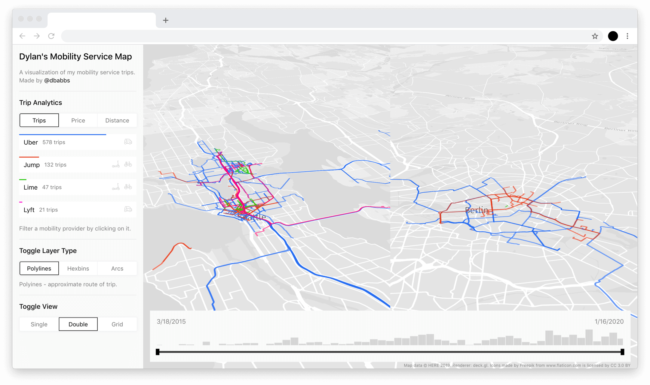
The Mobility Map is an interactive visualization of all my Uber, JUMP, Lime, and Lyft trips over nearly 5 years. The dashboard enables the user to explore the data set through a set of different visualization types and filters.

Motivation
I have always been interested in personal informatics, the concept of collecting data about one's behavior and habits for analysis. Combining this with my interest in maps and mobility, this project was particularly exciting to me because I was able to explore and visualize some geo data that also happened to be my own data. I wasn't trying to analyze my data in order to improve my behavior or solve a particular problem (for example: "I am spending too much money on Uber, let me figure out how to fix this"), but rather out of curiosity to learn more about my habits. I knew I had been heavily using these mobility services the past few years, especially with the recent introduction of the e-bikes and e-scooters, so I was curious about my usage.
Requesting an accessing the data
I began this project in May of 2019, approximately one year after the introduction of the EU's GDPR (General Data Protection Regulation). If it weren't for the introduction of GDPR, this project would likely be very difficult to accomplish due to the lack of ability to access your own personal data.
Article 15 of GDPR "Right of access by the data subject" enables any person residing within the European Union to request a copy of their personal data from a company they have signed up for. My strategy was to use this article to request my data from the mobility service providers.
Many companies, in expectation of the large operational overhead of dealing with manual data requests soon to be required due to GDPR, began building tools enabling users to request their data automatically.
Here's an overview of how I obtained my data from each of the four providers:
- Uber was one of the companies that built a handy data request tool. With just a few clicks on their website and a few minutes of waiting for my data to compile, I received a download of all my Uber data.
- JUMP data was included in my Uber data delivery because JUMP is owned by Uber.
- Lyft includes the ability to export your data to CSV via a button in their app. You will then receive an email with the data shortly.
- Lime was the most difficult company to request my data from. Lime did not have a data request tool at the time (and still does not as of January 28th, 2020). So, I had to resort to a manual request to their support and legal teams. After nearly two months of back and forth email conversations with Lime, I finally received a copy of my data set. Lime tried to argue that as a US citizen, I was not protected by GDPR and therefore was not entitled to a copy of my data set. I ended up convincing them by informing them I had used Lime scooters and bikes across Europe multiple times.
Enriching the data
Now that I had access to my data from all four of my mobility service providers, the next step of the process was enriching the data. This was a fun data problem to solve.
The process included the obvious step of normalizing all the data into a common model, as the data set was a collection from four different providers with different column names, data types, and more.
In terms of geographic data, the Uber, JUMP, and Lyft data sets only contained start and end addresses for the trip. I wanted to generate polylines of my trips, so I had to perform two steps:
- Convert the start and end addresses to coordinates (geocoding) using the HERE Geocoding API.
- Calculate the expected route from the start coordinates to the end coordinates using the HERE Routing API. The routing API does not accept addresses as parameters, so geocoding was a necessary prerequisite for using the routing API.
The following code block shows the simplified process of constructing a GeoJSON object with a route polyline from just a start and end address.
const lyft = data.map(async row => {
	const { total, origin, destination } = row;
	const startGeocode = await geocode(origin);
	const endGeocode = await geocode(destination);
	const { polyline, distance } = await route(startGeocode, endGeocode);
	return {
		type: 'Feature',
		geometry: {
			type: 'LineString',
			coordinates: polyline
		},
		properties: {
			provider: 'lyft',
			cost: total,
			distance
		}
	};
})
Some other basic data enrichment like currency conversion was also required.
Designing the visualization
When thinking about the visualization, I listed a couple requirements I wanted to accomplish. I wanted to learn:
- how much money I was spending
- how many trips I had taken
- how far I had traveled
- the location of my frequent origins and destinations
...with the ability to slice and dice the data by:
- provider
- time
With those requirements in mind, I settled on the following components:
Map Visualization Layers
- Polylines between my origin and destination. This would show the expected route I took as calculated by the routing API.
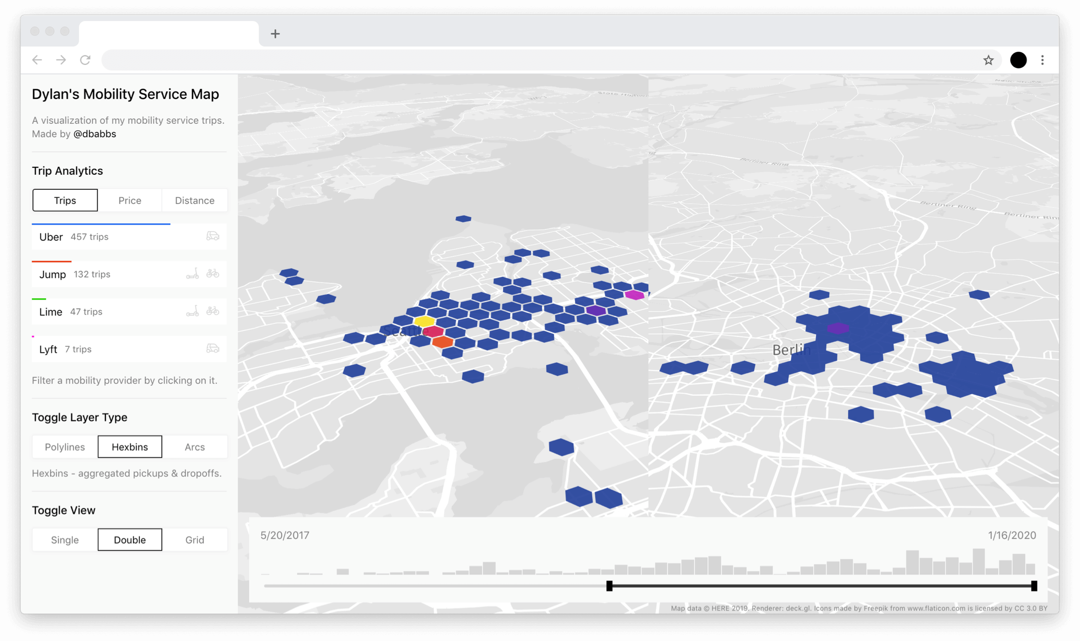
- Hexbins showing the density of my frequent pickup locations. This would show where my pickups were concentrated throughout the cities.
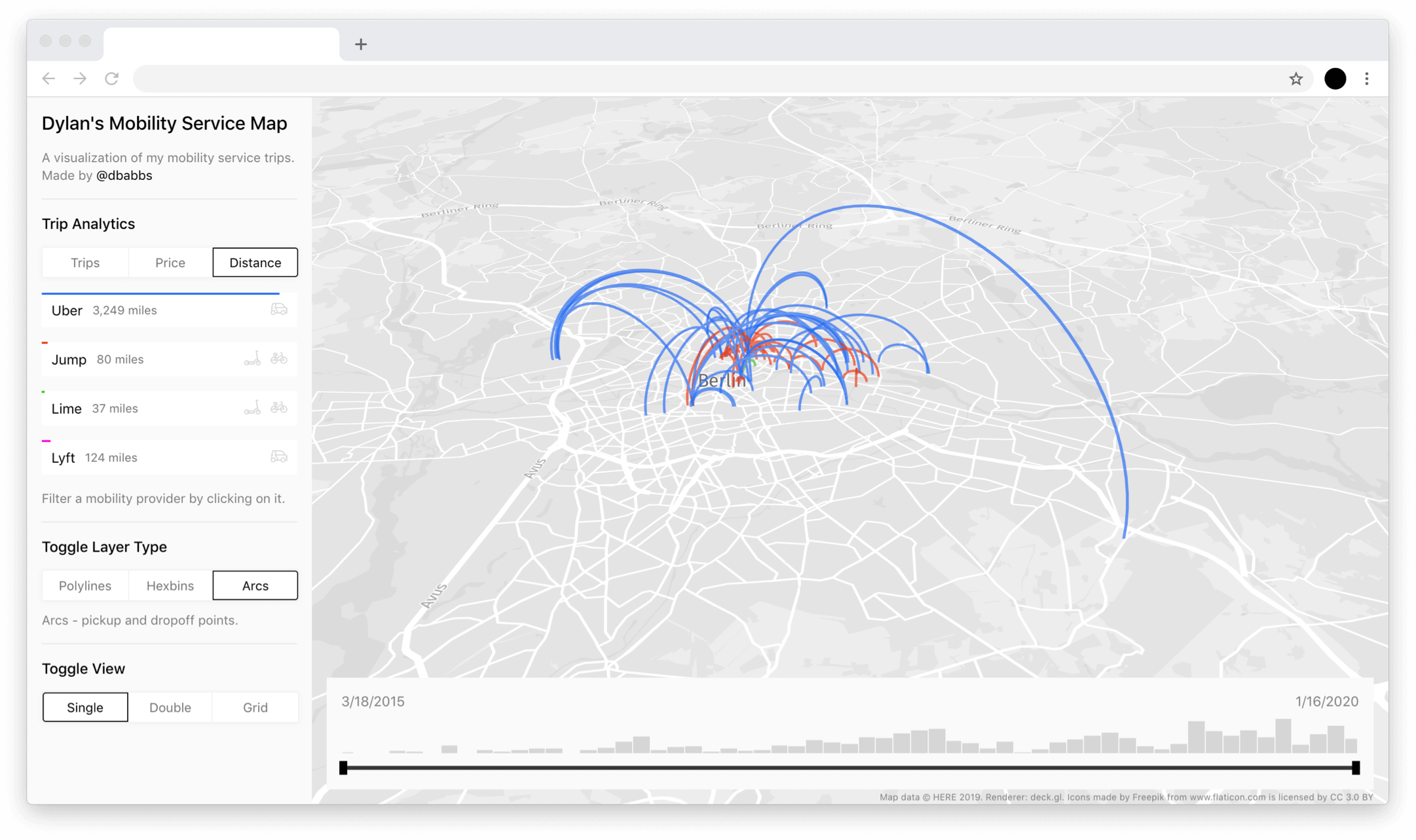
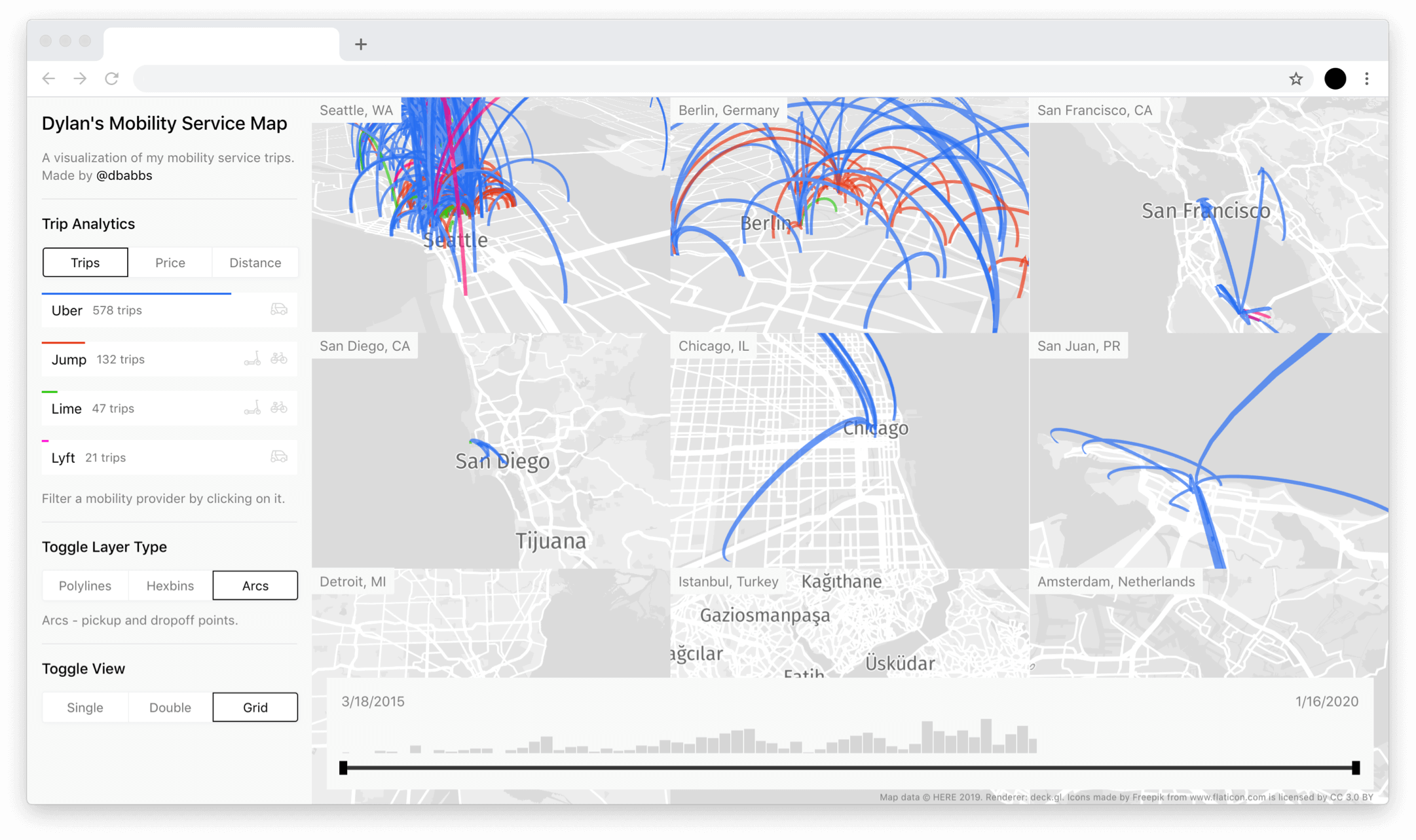
- Arcs between my origin and destination. The arc layer is slightly different from the polyline layer. The arc layer does not show the expected path I took between the origin and destination, so it's a nice visualization type for abstracting the path traveled.


Map Views
Since my trips were spread across multiple different cities, I wanted to enable viewing multiple cities at once. I created three different views that the user could toggle between.
- Single view: this view is a full-screen view of Seattle, the city with the highest number of trips. This view can be changed to view any city.
- Double view: this view is a full-screen view of my top two cities: Seattle and Berlin. The side-by-side double view is helpful for comparing two different cities at once.
- Grid view: this view is a 3x3 grid of my 9 most popular cities. This view, while overwhelming, gives one an idea of the wide range of cities I've used these services in.

Filters
- temporal (time) filter: the bottom of the map features a time-based filter, enabling one to filter all data by a date range. This filter also contains a histogram, which hints at the distribution of data over time.
- provider filter: the dashboard enables one to filter the data by a particular provider.
Basic statistics
Aside from the map and time components, a basic bar graph is also present that lets one learn about the number of trips, the number of money spent, and the distance traveled.
Building the visualization
Following the design of the visualization components, I also played around with the user experience and visual design of the dashboard. After many rounds of iteration within Sketch, I settled on a minimal black and light grey design system. I chose a black and light grey color scheme because I didn't want color from the UI to distract from the main star of the show: the map.
The map visualizations were built with deck.gl, a highly-performant geo data visualization engine. deck.gl enabled the slick path animation on startup.
The built the front-end components and interaction using React. deck.gl was also convenient to use because it works out-of-the-box with React.
Future work
I plan to keep developing this project over time. An area I would like to improve is the data compilation pipeline. Right now, accessing and wrangling the data is a manual process. I have to request a new copy of the data, enrich it, and then add it to the visualization by hand. I would like to investigate some sort of automatic integration into this application via an API everytime I take a trip.
Any questions or comments? Please reach out to me via Twitter or email.