Location is everything. It’s estimated that nearly 80% of all data produced contains location elements. But what exactly is location data? Location data can include anything from coordinates (latitude, longitude) to street addresses to zip codes to country names.
With the shear amounts of location data being produced, it’s crucial to retain the ability to derive value from one’s data, to separate the signal from the noise. Data visualization can provide this.
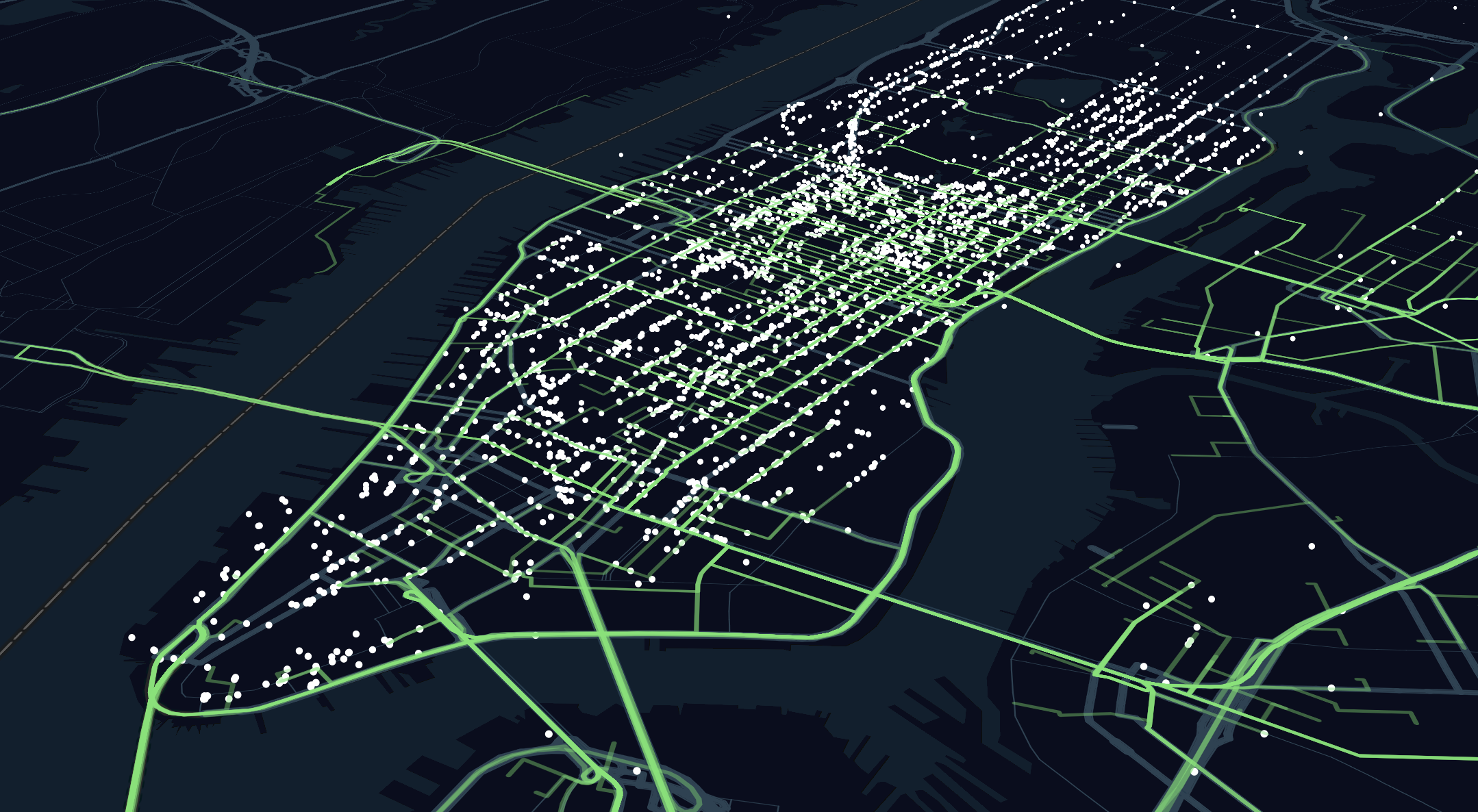
New York City taxi pickup points and routes.
With so many tools available, it’s easy to begin visualizing location-based data. This guide will cover the core elements of map data visualization design: data types, map styling, visualization types, encodings, and tips.
Basic
In order to properly design a map data visualization, it’s important to understand some general visualization theory: variable data types. Variable data types dictate the different visual encodings that can be used with data. Visualizations can't work with any data; certain visualizations require a specific variable type. Variable data types can also serve as a friendly guide for determining the correct visualization for one’s data. You may already be familiar with a few visualization types (nominal, ordinal, etc.), but in this guide, I'll stick to two major types:
- Qualitative variables are labels or categories, anything that includes text. Examples include apples, oranges, and bananas.
- Quantitative variables are numerical and represent a quantity, generally measurable numbers. Mathematical operations such as mean and median can be performed on quantitative variables. Examples include height, population, and bank account balance.
Map Styling
The core piece of any map data visualization is the map canvas. A straightforward way to think about a map-based visualization is an [x,y] plot—just like any other scatterplot or grid-based graph.
However, the difference between a grid-based visualization and a map visualization is that the canvas of the map visualization provides context through the map. The map, a digital representation of the physical world, provides references to physical objects (roads, parks, water) in the world. Instead of plotting data onto an empty [x,y] canvas, geo visualizations are plotted onto the context of the real world.
There are three recommended types of map canvases for visualization.
Satellite

A satellite map view.
Satellite maps are great for showing real world context. In fact, assuming the satellite tiles are up-to-date, they are as accurate of a depiction of the world one could find. They are literal photographs (taken by both planes and satellite) of the world—as opposed to human-derived representations of our world (traditional maps). Satellite maps should be used when the highest level of context is needed for the visualization. Satellite maps can sometimes be detrimental to the effectiveness of one’s visualization because the busyness of the map can distract from the overlaid data.
Traditional
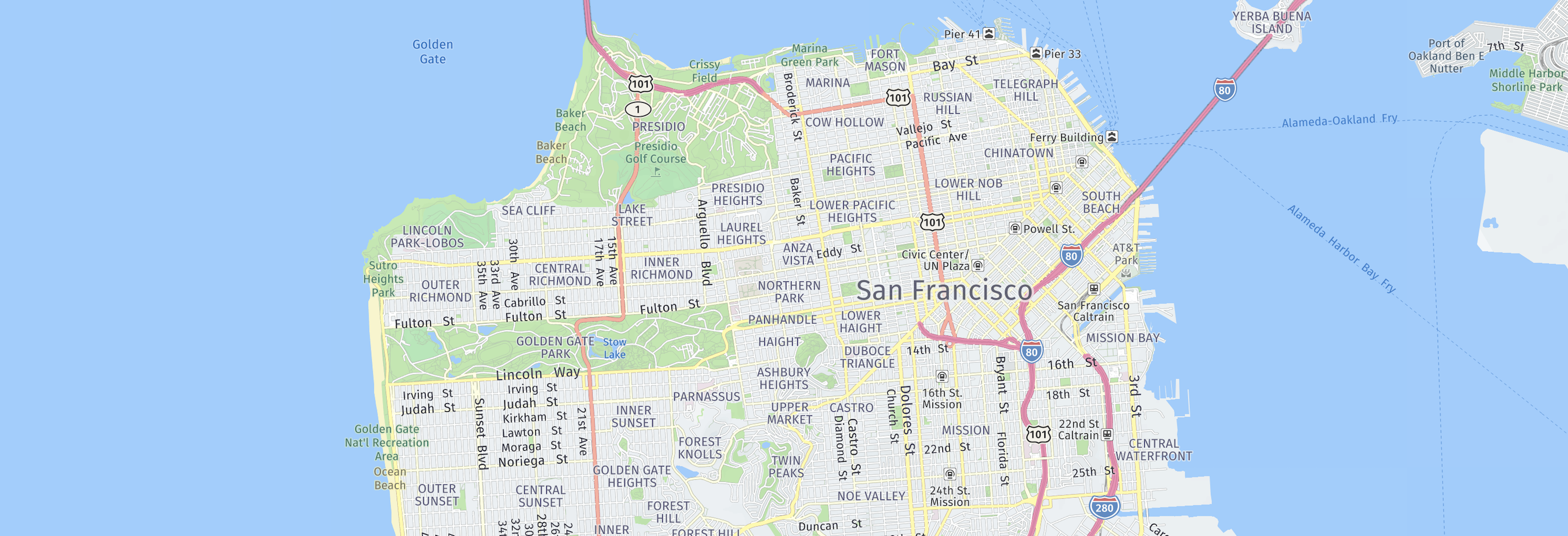
A traditional map view from HERE WeGo.
A traditional view is the default map one would see when browsing a consumer mapping application such as Google Maps, Apple Maps or HERE Maps. Traditional views are human-derived representations and contain artificial encodings of the earth’s objects, generally lacking the detail one of achieve with a satellite map. For example, a neighborhood park would be encoded as a green polygon in a traditional map, rather than a vivid grass field with visible trees and playgrounds in the view as it would look in a satellite map. Traditional map views are generally text-heavy, so make sure to decrease the text density to ensure it's not detracting from the visualization.
Minimal
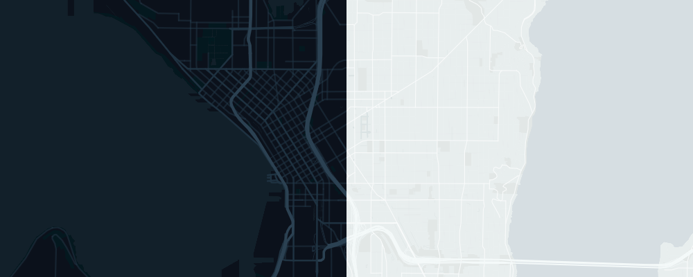
Side by side minimal maps (left: dark minimal; right: light minimal).
Minimal maps are simplified views of a traditional view. Minimal maps generally consist of a single color scheme and relatively low amounts of text and map objects. For example, a minimal map may not contain building outlines or high-level labels. The beauty of minimal maps is that they can be customized to fit one’s exact use case. Minimal maps are usually the best choice for map data visualizations, as they provide a small and necessary amount of location context, but still let the data tell the story.
A good tip is to never hide too much context, but still keep the map clean and readable. So, an ideal map canvas might be a mix of minimal colors and a conservative amount of map elements.
The majority of time, I choose a minimal map canvas for my visualizations.
Visualization Types
Points
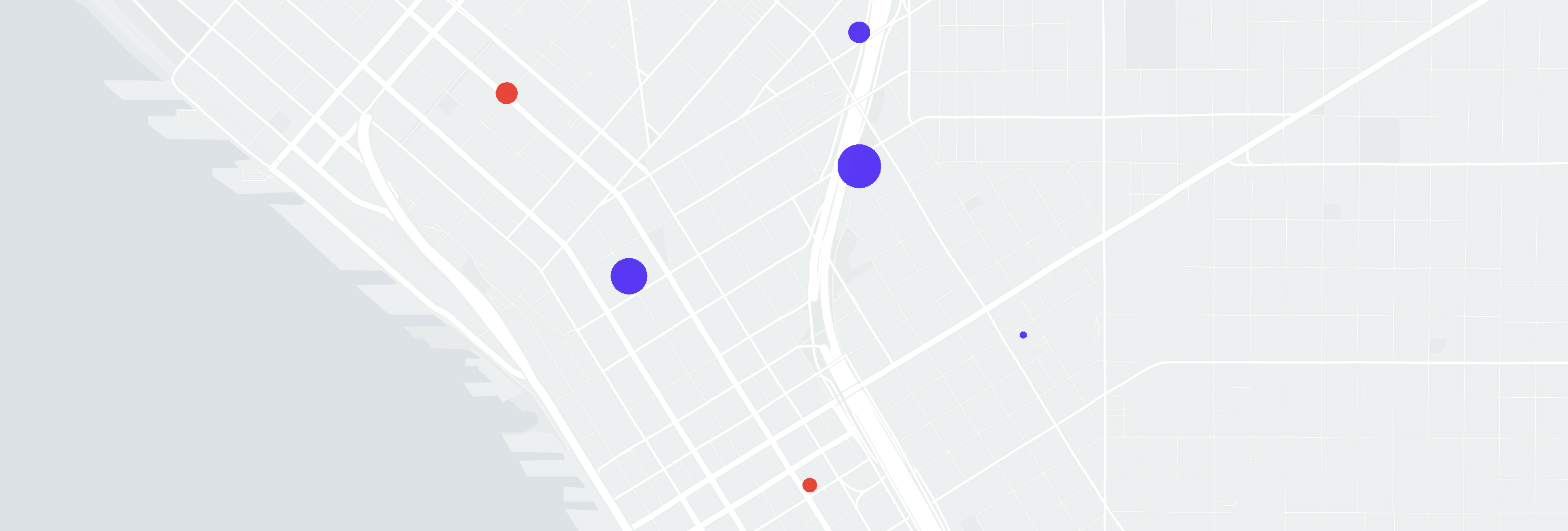
Points visualized in downtown Seattle. A qualitative variable is encoded by color and a quantitative variable is encoded by size.
Points are the most basic and straightforward map visualization type. They’re simple and intuitive. They show the location of single item, whether that be a person, place or thing, on a map. It’s as simple as can be—the point of the map shows the location of where the item is. Symbols can also be used as points.
Polylines
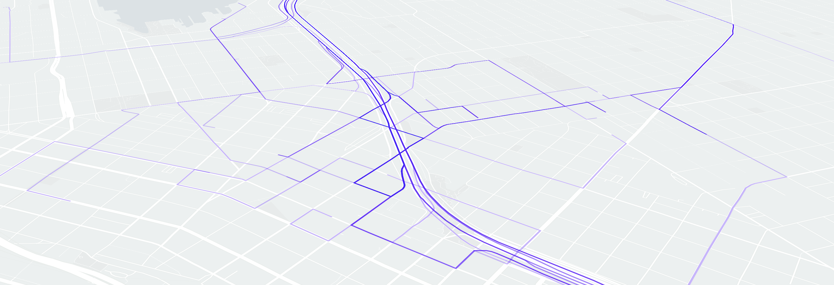
Polyline showing route paths in Seattle. Polyline are set to 30% opacity to in order to reveal overlapping lines.
Polylines are great for showing paths of moving objects. Polyline generally indicate change of location over time for an object, so they are great for datasets involving a time factor. Many polyline visualizations are of an objects route through time, as seen in the example above.
Choropleth / Polygons
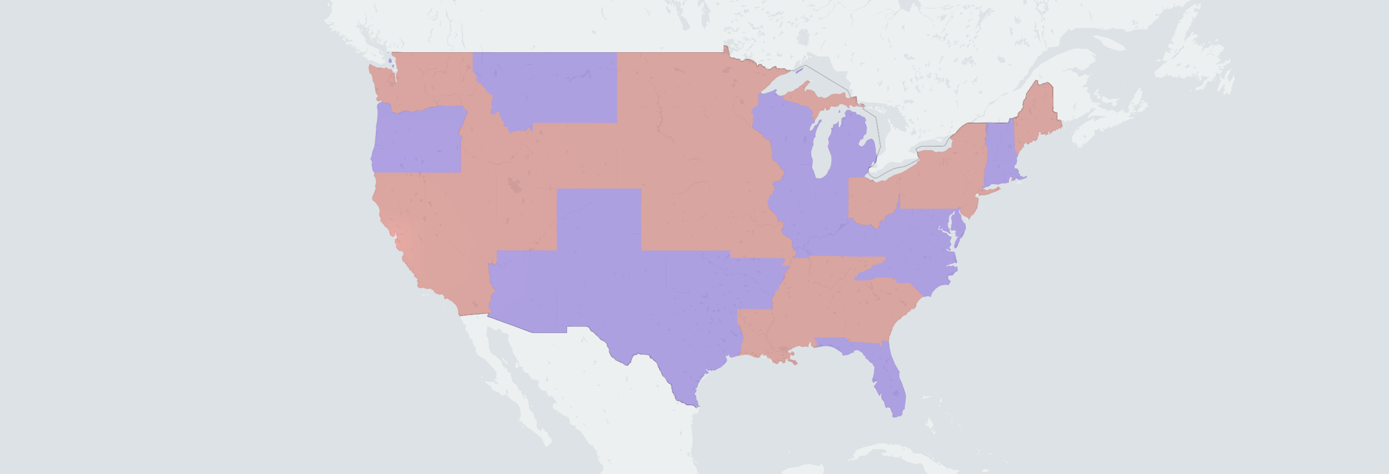
A choropleth of the area of the states of the United States. A qualitative variable encodes each state's color.
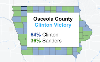
Choropleth maps are great for visualizing a quantitative or qualitative variable across a geographic area. Choropleth maps can either show aggregated values (quantitative variable) or a specific value (qualitative variable) from geographic areas. For example, a choropleth with qualitative data would be a US Presidential election results by state map. States are color encoded with either red or blue, depending on which party won. On the other hand, a quantitative variable encoded choropleth could be a map of life expectancy rates across all countries. The darker the shade of the color, the higher the life expectancy; the lighter the shade of the color, the lower the life the expectancy.
Choropleth shapes generally are the outline of administrative areas such as cities, counties or states. On the other hand, polygon shapes are generally custom defined shapes.
Bins
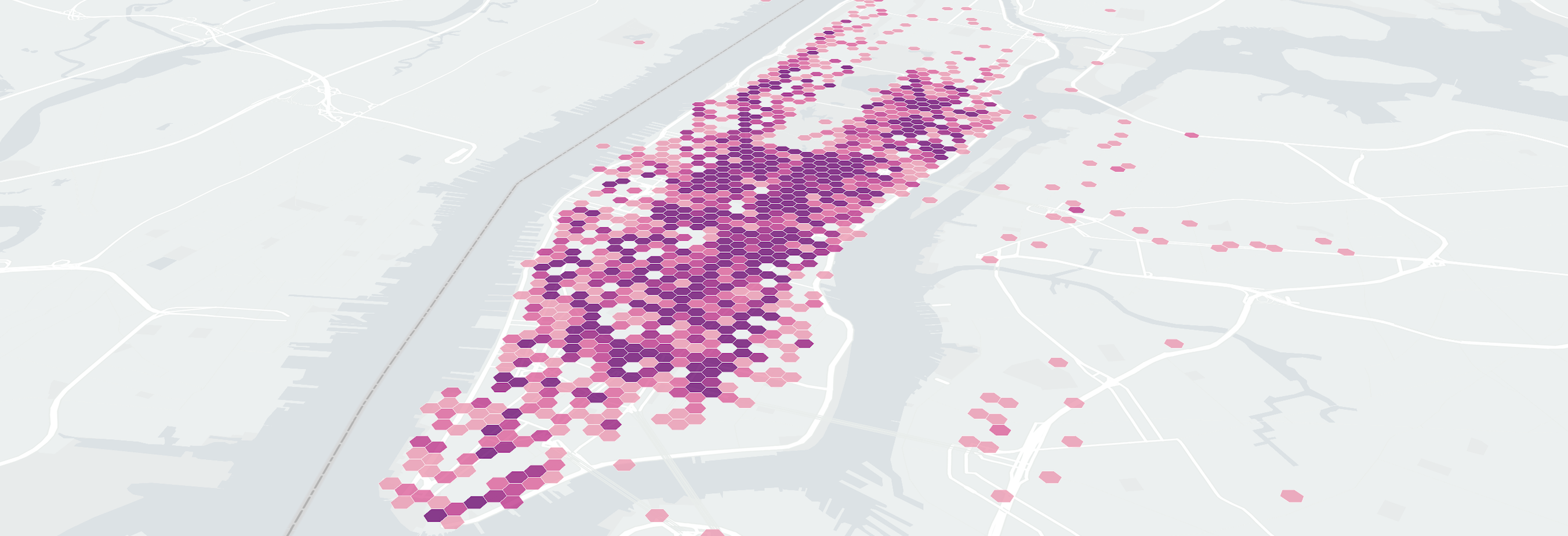
Hexagon-shaped bins of New York City taxi pick up locations.
Bins are similar to choropleths or polygons, with the exception being that bins consist of equal area polygons. Bins, a great alternative to point maps, show an aggregated value from the geographic area they cover, instead of lots of single points. Bins are great when showing concentrated data in high density areas. For example, on a normal point map, it may be unclear whether lots of points in a certain area overlap. Bins, since they group points in a geographic area, provide clarity in this type of situation. Bins don't necessarily need to be made up of square shapes; many visualization designers prefer triangles, hexagons and other shapes in lieu of squares. Additionally, bins don't need to represent density in an area, they can represent any encoded quantitative variable.
Heat Maps
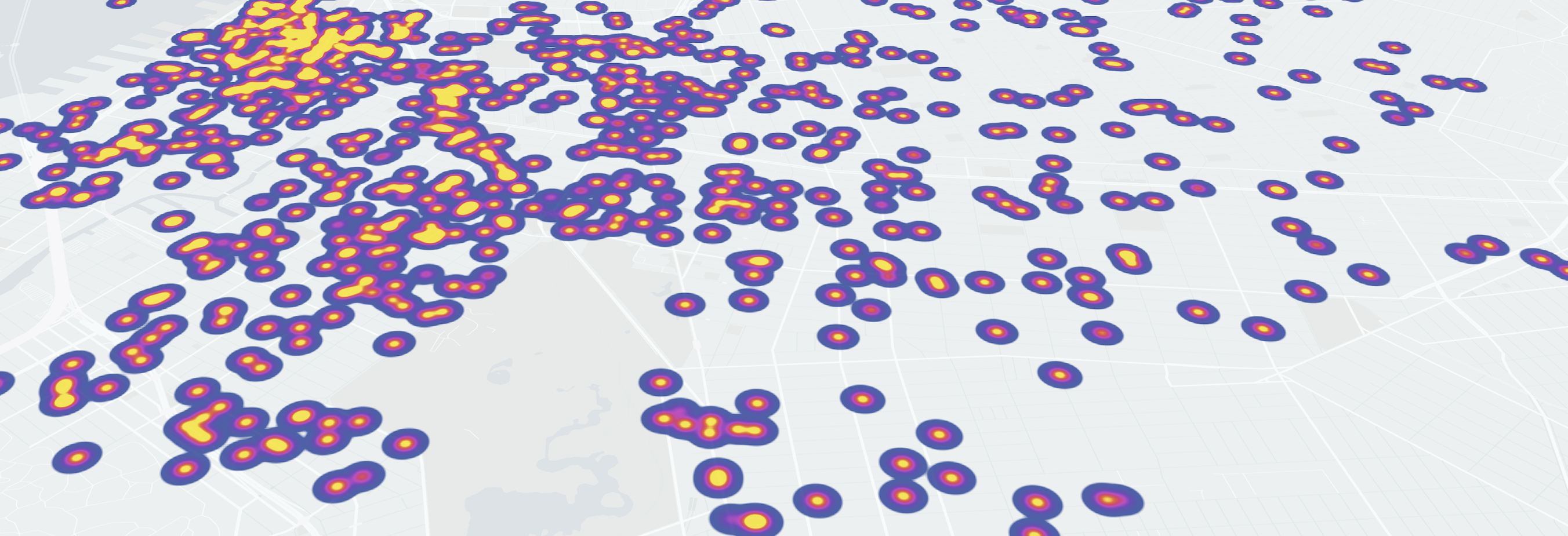
Heat maps represent density in a certain area and help expose the shape of the data. Heat maps encode density by a color scale. This visualization type serves the same purpose as bins, as they both demonstrate the density of the data, but heat maps go a step further and also show the shape of the data. A close cousin of the non-geographic heat map visualization.
Encodings
A visual encoding is the method of representing data in a visual structure. Popular visual encodings include size, shape, color, length, and position. Encodings bring a map data visualization to life, as they bring out the characteristics and meaning of the data.
If you’re looking to get technical on the effectiveness of each encoding, I recommend taking a look at Mackinlay's ranking of perceptual task.
Let’s say our data set has the following set of characteristics:
| Latitude | Longitude | Count |
|---|---|---|
| 34.345 | -22.453 | 7 |
| 32.832 | -24.218 | 2 |
| 28.129 | -22.837 | 4 |
An appropriate choice would be to encode the quantitative variable count with size. Now, each point would be sized depending on the value of count.
Listed below are some recommended encodings that can be used in a map data visualization.
Color
Color can be used to encode both qualitative and quantitative variables. For qualitative variables, one can use hue to match a specific color to an entity. For quantitative variables, one can employ a continuous color scale to match numerical values.

A hue color palette for qualitative variables. The colors have no relation to each other; each color is assigned to a different field of the quantitative variable.
A continuous color scale for quantitative variables.
Symbol
When working with qualitative variables, symbols can be a good alternative to colors, especially if one’s dataset consists of points. Instead of a generic point, assign different symbols to represent the data.

Size
When it comes to quantitative data, size encoding works well in map visualizations.
Extrusion
Extrusion is a unique way to encode a quantitative variable. Extrusion exposes the height of an object to a variable. Extrusion can only be achieved with a 3D rendering engine—not offered yet by many map data visualization libraries and frameworks. Extrusion can be used with points, bins, polylines, or polygons.
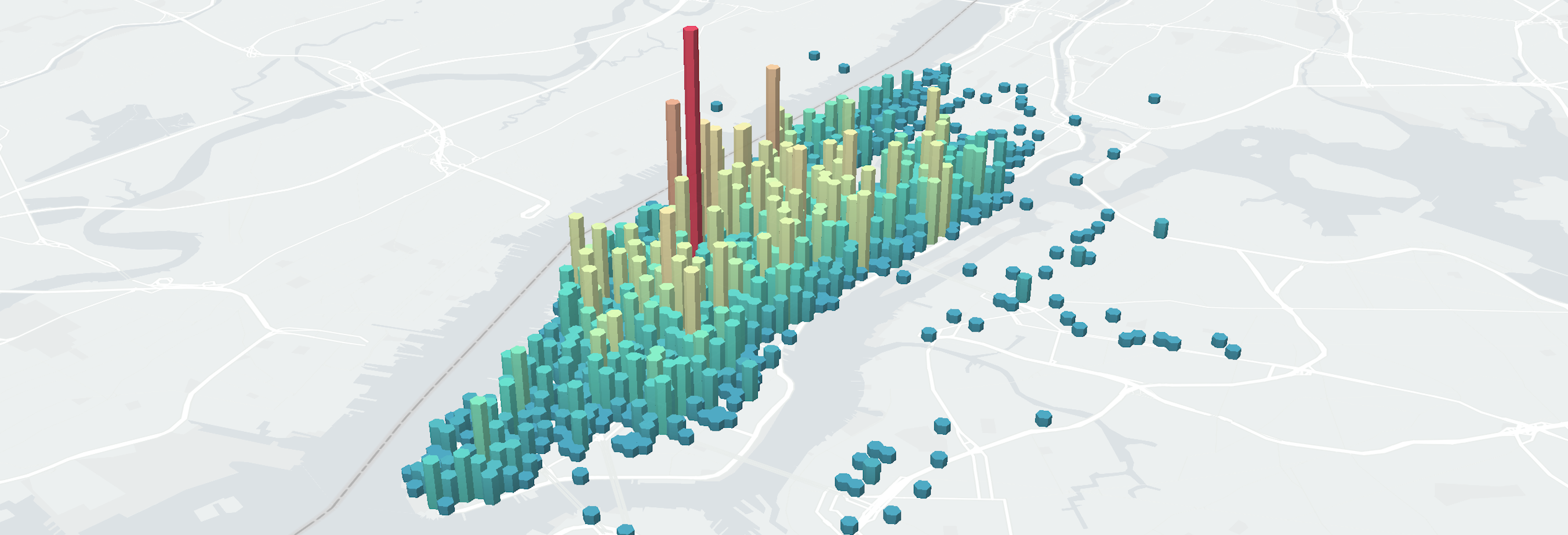
Extruded hex bins of NYC taxi pickup locations. The height of the bins in this case represent density, but they can normally represent any quantitative variable.
It’s important to note that I’ve left out position in this list of encodings—that’s because, by default, all map data visualizations already are encoded by position: latitude (x) and longitude (y). Coordinates are the core of any map data visualization; at minimum, a latitude and longitude is required to establish a map visualization.
Tips
Map styling, visualization types, and encodings are the basics to know in order to make a powerful map visualization, but there are further tips to apply to a visualization to increase its effectiveness.
View
Choosing the right zoom level is important. Ensure the zoom level of the visualization is at an appropriate level that all data overlays can be understood easily. Consider the data being presented. If the data is low-level street data, choosing a higher zoom level. If the data is high-level geographic boundaries, choose a lower zoom level.
Side by side maps should usually show the same zoom level.
Changing the pitch and bearing can add a unique twist to maps. The majority of maps are north-facing with a top-down view. Modifying the pitch so the visualization can be seen from a creative angle or viewpoint will add novelty to a visualization.
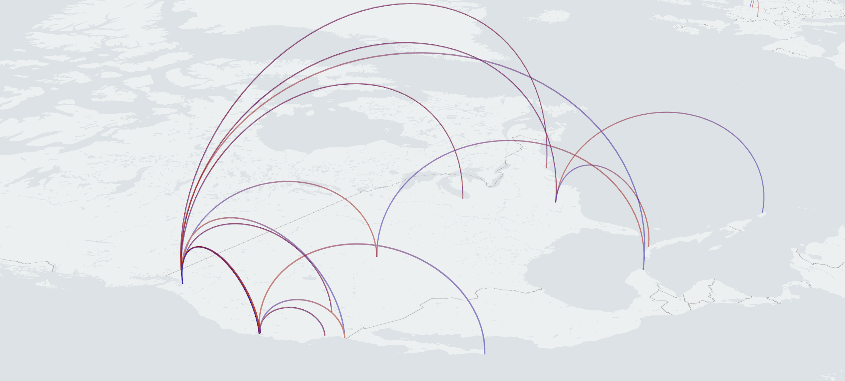
A map with a modified pitch and bearing so the 3D arcs can be shown.
Interaction
Ensure the user has as much freedom as possible for interactive exploration of the visualization. Permit the user to change the zoom level, the pitch, or the bearing via intuitive controls. Static maps, in many situations, can be effective, but they're also not as interesting or appealing if one can't interact freely with them. Allow the user to dive into the data and explore however they please.
Isolation can be a powerful technique if implemented correctly. In a dense visualization, giving the user the ability to isolate certain points or polyline upon hover can allow for a clearer view of a certain object.
Tooltips give additional information about a certain object in the visualization. If the dataset contains non-geographic fields that aren't visualized, this is a good place to list the data. A tooltip allows the user to drill down into a certain row and allows for increased data understanding.
A tooltip seen in a Tableau map. The tooltip presents additional information about a selected geographic region.
Animation
When working with temporal data, consider enabling time-based animation. Time-based animation is powerful as it can demonstrate the change in a dataset progressively over time. Allowing a consumer of the visualization to 'play back' a sequence of the data over time is another valuable method of increasing the effectiveness of the visualization.
Animation can also be used simply for eye-candy purposes. Fun animations or transitions throughout the visualization, while not intrusive, can make a visualization memorable.
For more interesting location technology content, follow me on Twitter @dbabbs.
Screenshots and visualizations created using either HERE Developer assets or Deck.GL with custom map tiles.